
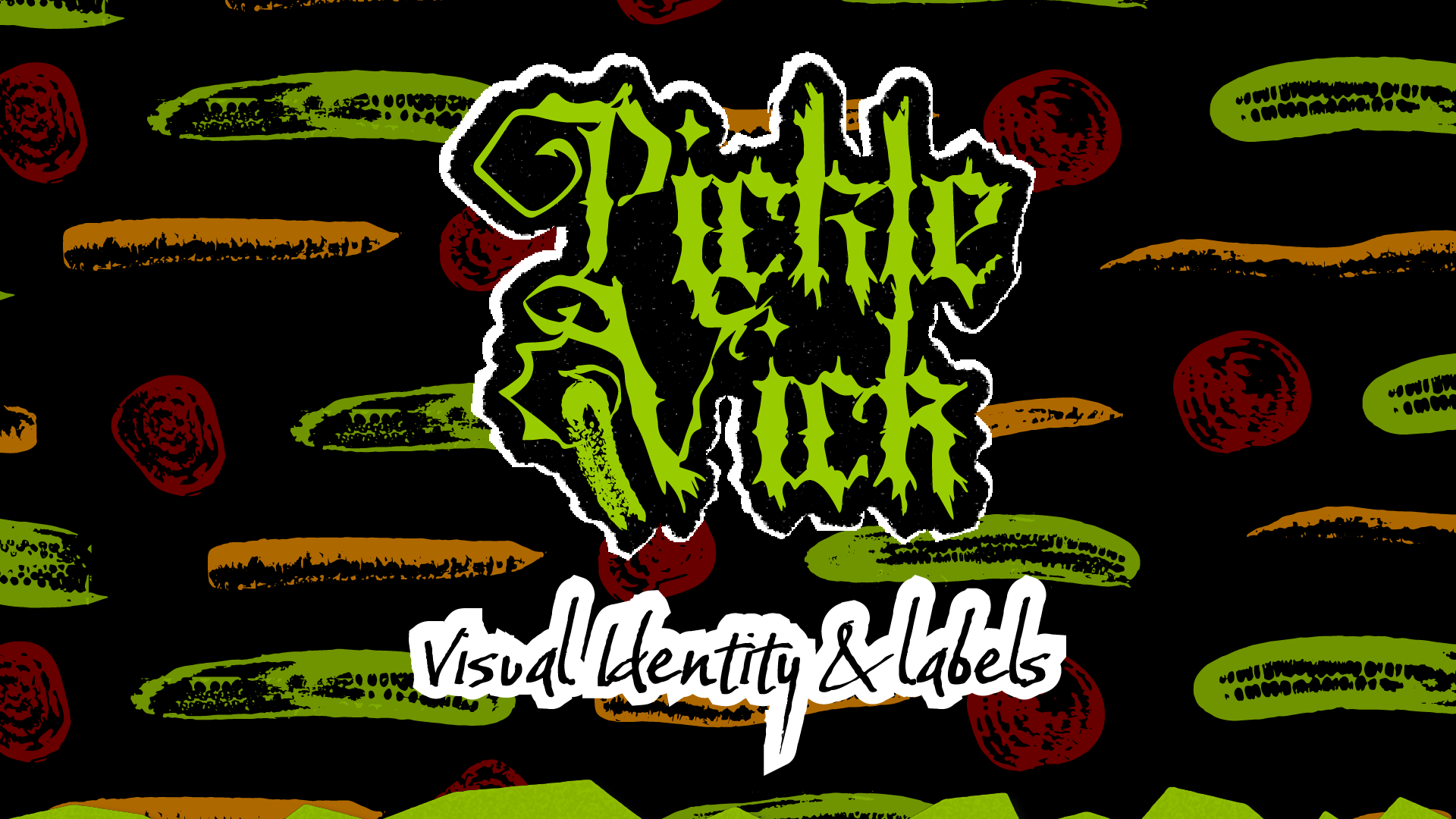
Pickle Vick
I was tasked with creating a Visual Identity for Pickle Vick, a startup Pickle company that is in the process of launching its products. The company sells pickled cucumbers, beets, and carrots in farmers markets in Alberta, Canada. Their target market includes anyone who loves pickled goods with bold flavors. The owners were looking for an edgy, punk aesthetic to match their next level, outside-the-box flavors and invite their customers to “Join the Flavor Revolution!”
The vision for the brand was heavily inspired by 70’s and 80’s punk, as well as grind core aesthetics. The goal was to convey the edgy, against the grain vibe with sharp corners and bold contrasting colors. Stamped imagery and torn paper also became a major point of reference when creating the brand.
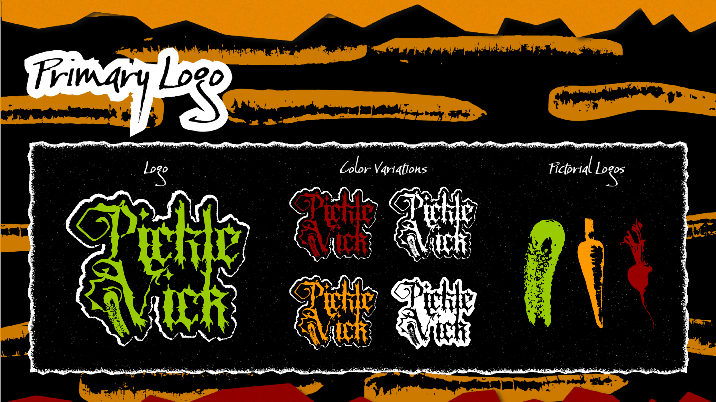
Inspired by Grind core and punk, the Pickle Vick logo utilizes a manipulated blackletter typeface and is paired with a pickle growing from sharp vines on the V. The pickle represents the first official product “Hot Horseradish Dills”, ad serves as an effective identifier of the brands offerings. Additional veggie icons, as well as an array of color variations make the logo responsive and uniquely versatile.
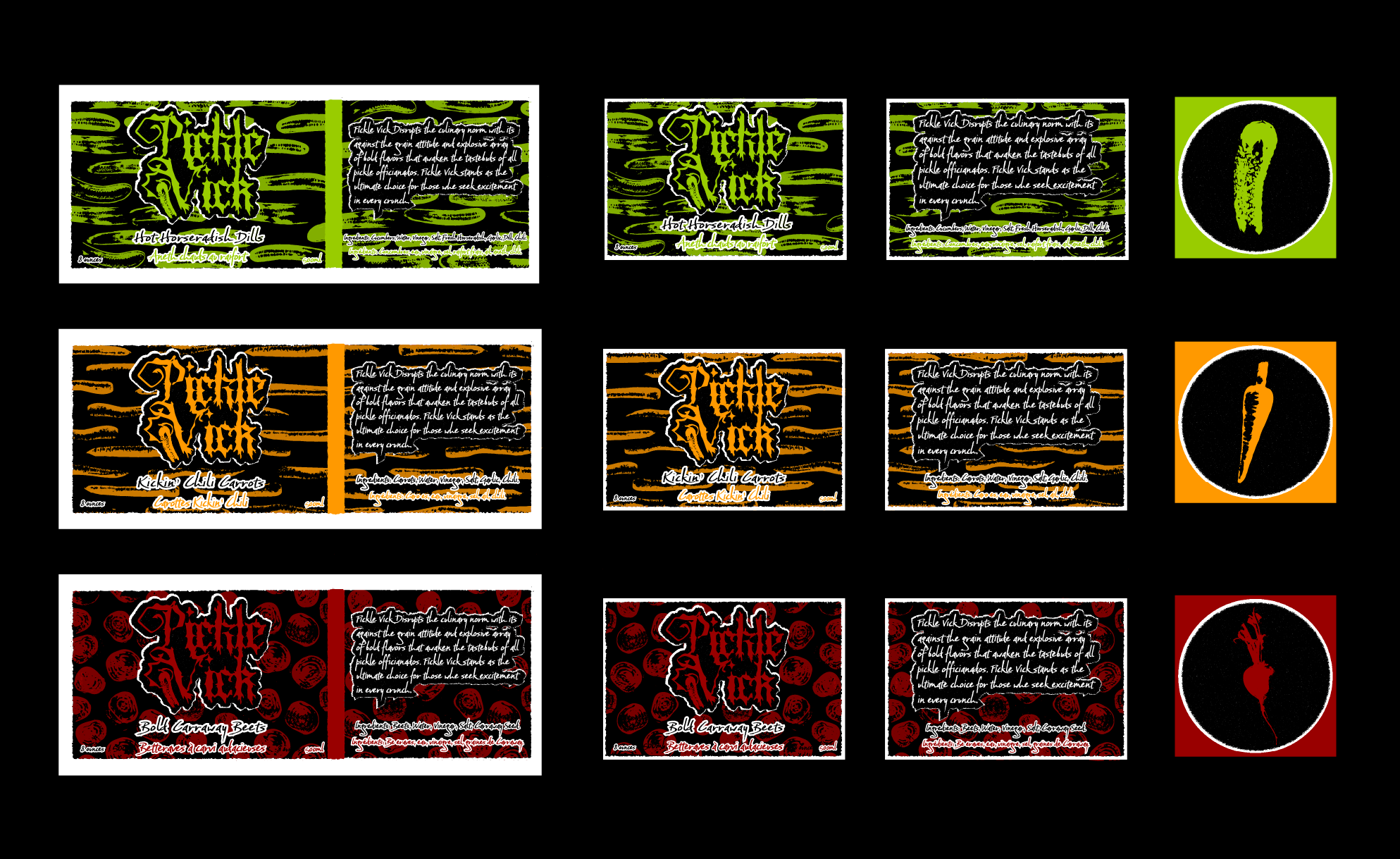
Complete with a unique stamped veggie pattern, bold colors, and rough torn edges, the labels pop off the jars. The 2”x3” labels will sit on the front and back of the jar, while the 2.5”x6” labels will wrap around the front and right side of the jar. Pickle Vick’s values are stamped on the back of the labels, reminding customers to “Join the Flavor Revolution”! Since Pickle Vick is an Alberta, Canada based company, all of the labels include French translations for the product and its ingredients.

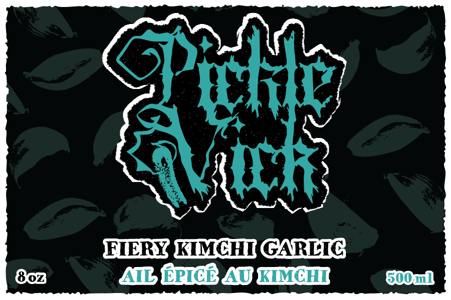
About two years after the initial project was delivered to the client, we decided to revisit some of the design choices and add two more products to the line. We adjusted the background of the labels and changed the secondary font to be more readable for sight impaired customers. The client loved the idea of incorporating teal into the brand so we worked closely to find a color that would fit their bold identity. All and all, it was a series of subtle, yet effective changes that helped the brand draw more eyes at market.